TOC
Background
To start off with, this is my first blog post! Obligatory yay!

Anyhow.
I live in Stockholm, but I come from South Africa. I know the average Stockholm summer not to be too hot, and slightly cooler than would be ideal. This suits me fine, as I’m not a fan of summers of the face-melting variety. This is probably part of the reason that I was happy to move here. And it’s my experience from speaking to other expats here from warmer climates that they all pretty much feel the same way (nice selection effects going on for those who move to colder places…). In any case, this summer has most certainly been of the face-melting variety, leading to wild fires and later floods, and I wanted to see what the data actually looked like. Why? Because that’s the kind of thing I do.
A second motivation is my current location (at the time of my writing this at the beginning of August - though I’m posting this a couple of weeks later), sitting in a café, since my office at Karolinska Institutet is not a place to be. Firstly, it does not have air conditioning: this is standard for Stockholm. However, it also does not have a working ventilation system. This has been the case for all of the 7 years that I have worked in the office. We have consistently complained, received promises that it would be fixed, but it never was. Our IT guy, while installing digital thermometers to measure the server room (which does have AC), also decided to install a couple of extra thermometers on the inside and outside of his office (beside mine, and sharing a common ventilation system) to have something to show to back up our case. Why? Because that’s the kind of thing he does.
This makes for a great dataset, and a great research question too!
Setup
library(tidyverse)
library(viridis)
library(lubridate)
library(prophet)

theme_set(new = theme_bw())
SMHI
SMHI is the Swedish Meteorological and Hydrological Institute. They make their data available with the maximum and minimum temperature each day. So I downloaded the data from here, just to get an idea of the outdoor temperatures.
Daily Minimum and Maximum
I chose the daily maximum and minimum temperatures for Stockholm. The data is separated into historical data, and data from the last 4 months. So I’ll first combine those.
smhidat_temp <- read_delim('../../static/data/20180821_StockholmWeather/RawData/minmax_hist_smhi-opendata_19_20_98210_20180801_075209.csv',
                           skip = 10,
                           delim = ";") %>%
  select(1:7)   # There's an extra data table on the right hand side

smhidat2_temp <- read_delim('../../static/data/20180821_StockholmWeather/RawData/minmax_4m_smhi-opendata_19_20_98210_20180801_075213.csv',
                            skip = 10,
                            delim = ";") %>%
  select(1:7)

smhidat <- bind_rows(smhidat_temp, smhidat2_temp)

head(smhidat)
## # A tibble: 6 x 7
## `Från Datum Tid (U~ `Till Datum Tid (U~ `Representativt~ Lufttemperatur
## <dttm> <dttm> <date> <dbl>
## 1 1960-12-31 18:00:01 1961-01-01 18:00:00 1961-01-01 -0.2
## 2 1961-01-01 18:00:01 1961-01-02 18:00:00 1961-01-02 -0.7
## 3 1961-01-02 18:00:01 1961-01-03 18:00:00 1961-01-03 0.7
## 4 1961-01-03 18:00:01 1961-01-04 18:00:00 1961-01-04 0.4
## 5 1961-01-04 18:00:01 1961-01-05 18:00:00 1961-01-05 -0.3
## 6 1961-01-05 18:00:01 1961-01-06 18:00:00 1961-01-06 -0.3
## # ... with 3 more variables: Kvalitet <chr>, Lufttemperatur_1 <dbl>,
## # Kvalitet_1 <chr>And now let’s fix it up a little.
smhidat <- smhidat %>%
  select(Date = "Representativt dygn",
         LoTemp = "Lufttemperatur",
         HiTemp = "Lufttemperatur_1") %>%
  mutate(DayNumber = as.numeric(format(Date, "%j")),
         Year =  as.numeric(format(Date,format="%Y")),
         Decade = 10*floor(Year/10))

head(smhidat)
## # A tibble: 6 x 6
## Date LoTemp HiTemp DayNumber Year Decade
## <date> <dbl> <dbl> <dbl> <dbl> <dbl>
## 1 1961-01-01 -0.2 1 1 1961 1960
## 2 1961-01-02 -0.7 1.9 2 1961 1960
## 3 1961-01-03 0.7 2.5 3 1961 1960
## 4 1961-01-04 0.4 2.8 4 1961 1960
## 5 1961-01-05 -0.3 3 5 1961 1960
## 6 1961-01-06 -0.3 1.6 6 1961 1960Excellent! Let’s take a peak then.
ggplot(smhidat, aes(x=DayNumber, y=HiTemp, colour=Year, group=Year)) +
  geom_line(alpha=0.5) +
  scale_colour_viridis() +
  geom_line(data=filter(smhidat, Year==2018), colour="red", size=1) +
  labs(title="Daily Maximum Temperatures",
       subtitle="2018 highlighted in red",
       x="Day Number",
       y="Temperature (Celsius)")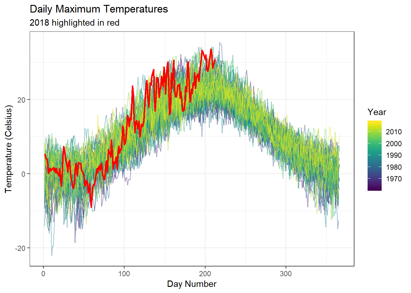
ggplot(smhidat, aes(x=DayNumber, y=LoTemp, colour=Year, group=Year)) +
  geom_line(alpha=0.5) +
  scale_colour_viridis() +
  geom_line(data=filter(smhidat, Year==2018), colour="red", size=1) +
  labs(title="Daily Minimum Temperatures",
       subtitle="2018 highlighted in red",
       x="Day Number",
       y="Temperature (Celsius)")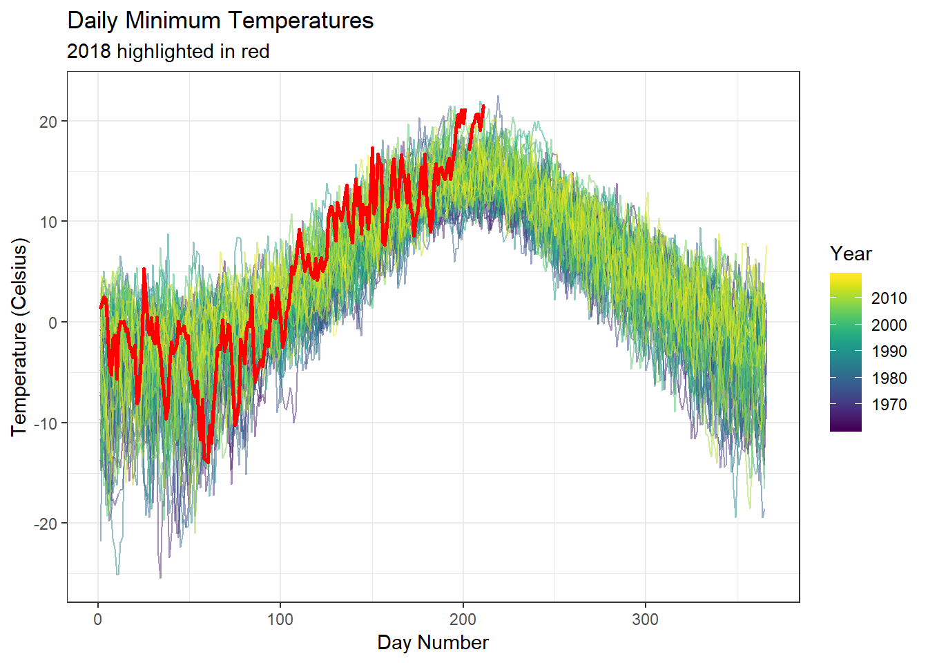
Here I’ll examine relative temperatures by day across the year to get an idea of gradual changes over time.
scale_vals <- function(values) {
  values <- values[!is.na(values)]
  (values - mean(values)) / sd(values)
}

smhidat_zscores <- smhidat %>%
  filter(!is.na(HiTemp) & !is.na(LoTemp)) %>%
  group_by(DayNumber) %>%
  mutate(DayZ_high = scale_vals(HiTemp),
         DayZ_low = scale_vals(LoTemp)) %>%
  ungroup()


ggplot(smhidat_zscores, aes(x=DayNumber, y=Year, fill=DayZ_high)) +
  geom_tile()  +
  labs(title = "Stockholm Relative Maximum Temperatures by Year") +
  scale_fill_viridis("Standardised Daily Maximum Temperature", option = "A") +
  scale_y_continuous(trans="reverse") +
  theme_minimal() +
  theme(legend.position="bottom")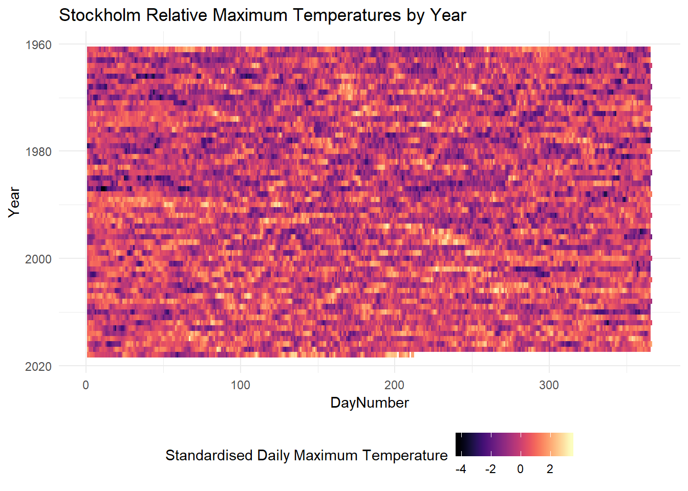
ggplot(smhidat_zscores, aes(x=DayNumber, y=Year, fill=DayZ_low)) +
  geom_tile()  +
  labs(title = "Stockholm Relative Minimum Temperatures by Year") +
  scale_fill_viridis("Standardised Daily Minimum Temperature", option = "A") +
  scale_y_continuous(trans="reverse") +
  theme_minimal() +
  theme(legend.position="bottom")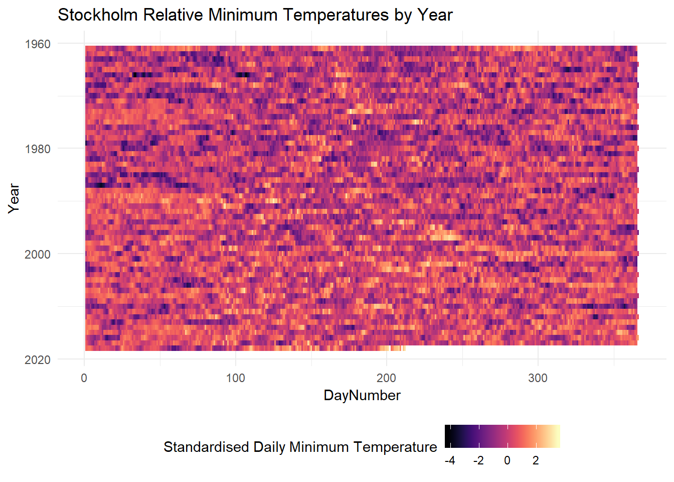
There seems to be some increase with increasing year, but it seems quite subtle in this plot.
Weekly Temperatures
In order to get a slightly smoother line by which to compare the yearly trends, I’ll calculate the mean of the daily maximum and minimum temperatures across each week of each year and compare the years on those. This might give us a better idea of the general yearly trends, rather than extreme days here and there.
smhidat_weekly <- smhidat %>%
  mutate(Week = week(Date)) %>%
  group_by(Year, Week) %>%
  summarise(MeanHigh = mean(HiTemp, na.rm = T),
            MeanLow = mean(LoTemp, na.rm = T))

ggplot(smhidat_weekly, aes(x=Week, y=MeanHigh, colour=Year, group=Year)) +
  geom_line(alpha=0.5) +
  scale_colour_viridis() +
  geom_line(data=filter(smhidat_weekly, Year==2018), colour="red", size=1) +
  labs(title="Mean Weekly Maximum Temperatures",
       subtitle="2018 highlighted in red",
       x="Week Number",
       y="Temperature (Celsius)") +
  scale_x_continuous(breaks=seq(from = 0, to=60, by=5),
                      minor_breaks = NULL)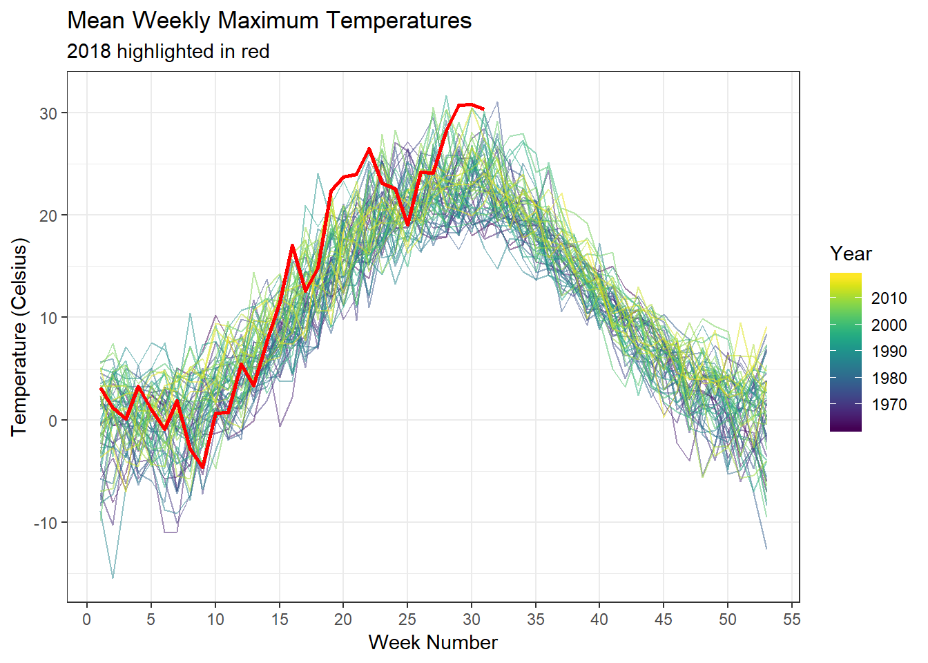
ggplot(smhidat_weekly, aes(x=Week, y=MeanLow, colour=Year, group=Year)) +
  geom_line(alpha=0.5) +
  scale_colour_viridis() +
  geom_line(data=filter(smhidat_weekly, Year==2018), colour="red", size=1) +
  labs(title="Mean Weekly Minimum Temperatures",
       subtitle="2018 highlighted in red",
       x="Week Number",
       y="Temperature (Celsius)") +
  scale_x_continuous(breaks=seq(from = 0, to=60, by=5),
                     minor_breaks = NULL)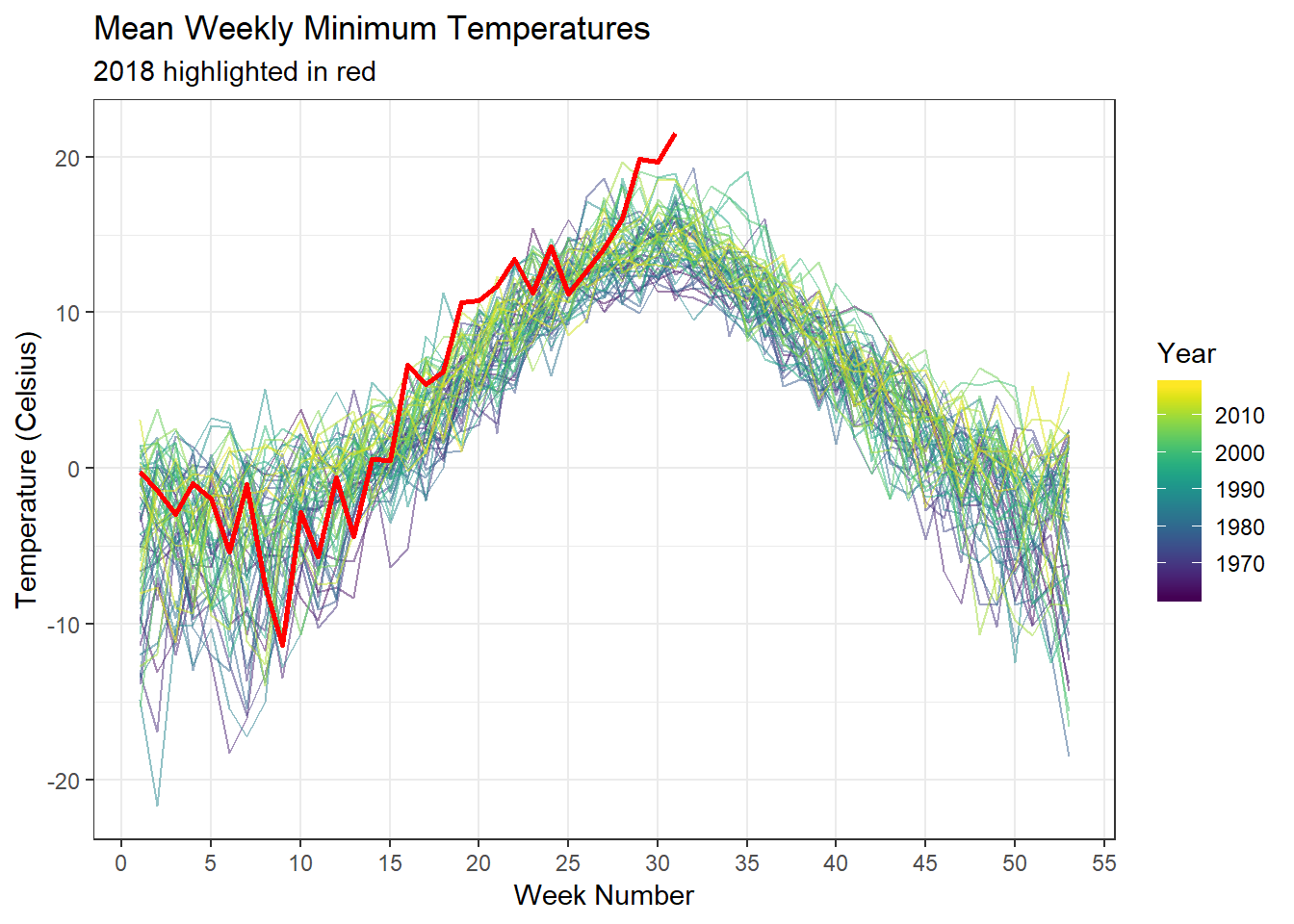
This makes it much more clear that this year has had several weeks which have the hottest maximal temperatures on record since the 1960s, and by several degrees too… This is due to regression to the mean: several days in previous years have, by chance, been very warm, but this summer has had high temperatures which were more consistently high compared to previous years.
Time Series
Let’s run a time series analysis to visualise trends over time. I’m a complete novice in time series analysis, but the prophet package does a pretty good job of such an analysis without requiring much expertise by the practitioner, by using a bunch of sensible defaults. Perfect! :)
predseq <- smhidat$Date
future_df <- data.frame(ds = c(predseq)) %>%
  filter(ds > as.Date("2000/01/01"))

future_df_hi <- select(smhidat, y=HiTemp, ds=Date)
future_df_lo <- select(smhidat, y = LoTemp, ds=Date)
And let’s fit it. This takes a while (all night actually), so I’ll do it once, save the fit, and set eval=FALSE for the code block…
hi_model <- prophet(future_df_hi, weekly.seasonality = F,
                    daily.seasonality = F, mcmc.samples = 500)

saveRDS(hi_model, file = '../../static/data/20180821_StockholmWeather/hi_model.rds')


lo_model <- prophet(future_df_lo, weekly.seasonality = F,
                    daily.seasonality = F, mcmc.samples = 500)

saveRDS(lo_model, file = '../../static/data/20180821_StockholmWeather/lo_model.rds')
… and just load the model fits.
hi_model <- readRDS('../../static/data/20180821_StockholmWeather/hi_model.rds')
lo_model <- readRDS('../../static/data/20180821_StockholmWeather/lo_model.rds')
High Temperatures
forecast_hi <- predict(hi_model, future_df)
prophet::prophet_plot_components(hi_model, forecast_hi, uncertainty = T)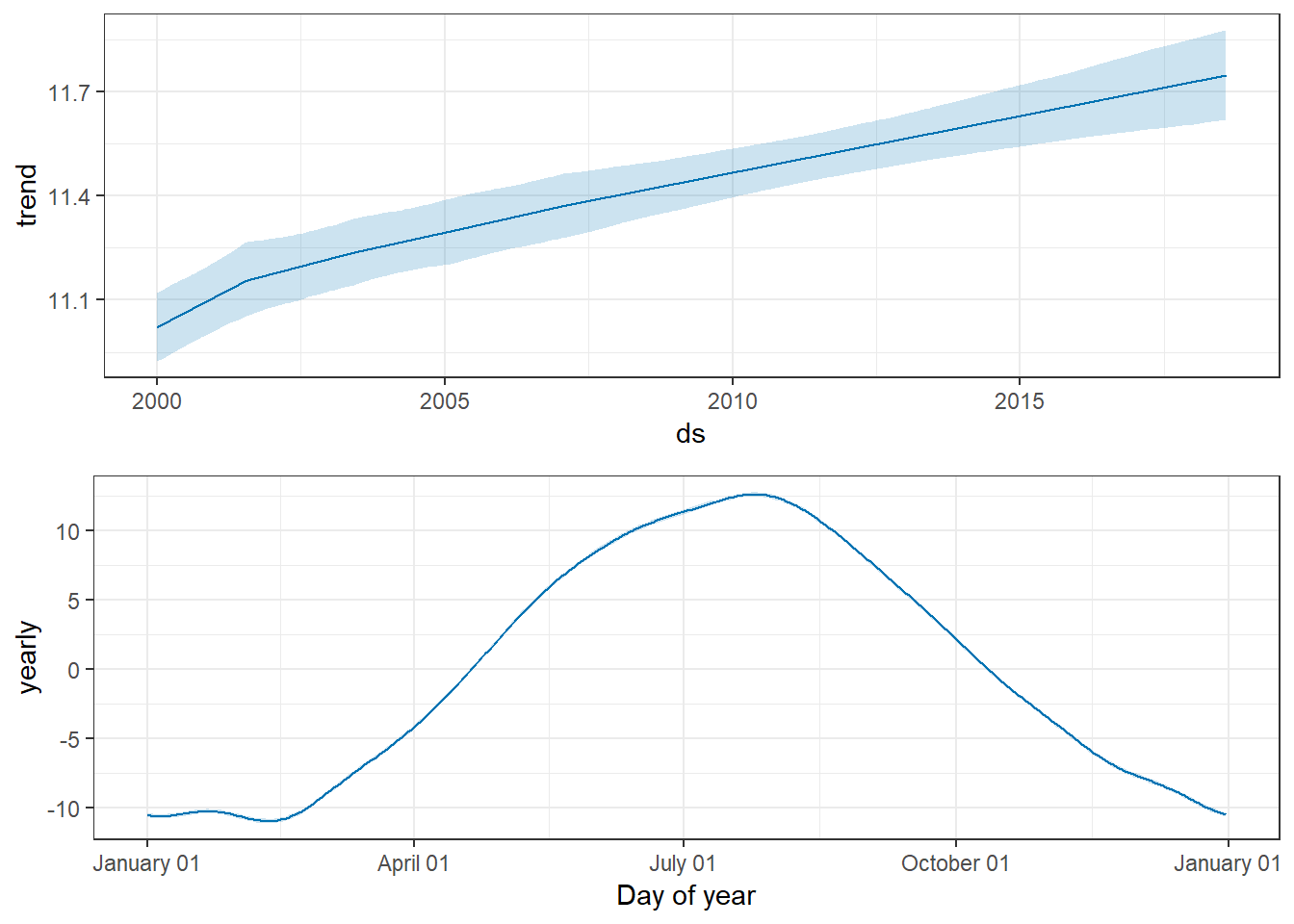
Low Temperatures
forecast_lo <- predict(lo_model, future_df)
prophet::prophet_plot_components(lo_model, forecast_lo, uncertainty = T)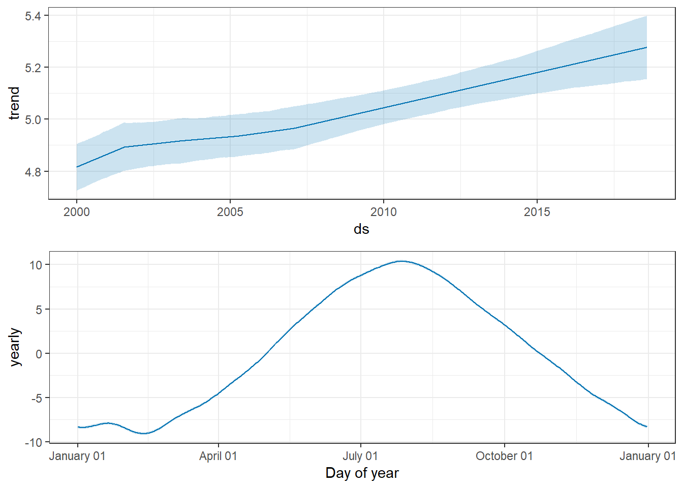
Summary
Well, that’s depressing. Seems climate change is actually pretty easily visible in this little dataset… :(
Our office
So, now let’s get to the exciting stuff! The recordings of our office temperature…
officetemp <- read_delim('../../static/data/20180821_StockholmWeather/RawData/temperature.txt',
                         delim="\t ", trim_ws = T,
                         col_names = c("DateTime", "Inside", "Outside"))

officetemp <- officetemp %>%
  mutate(Time = format(DateTime, "%H:%M:%S"),
         DayNumber = as.numeric(format(DateTime, "%j")),
         Year =  as.numeric(format(DateTime,format="%Y")),
         Decade = 10*floor(Year/10),
         Date= as.Date(format(DateTime, "%Y-%m-%d")))

tail(officetemp)
## # A tibble: 6 x 8
## DateTime Inside Outside Time DayNumber Year Decade
## <dttm> <dbl> <dbl> <chr> <dbl> <dbl> <dbl>
## 1 2018-08-01 07:40:01 32.2 25.4 07:4~ 213 2018 2010
## 2 2018-08-01 07:50:01 32.3 25.8 07:5~ 213 2018 2010
## 3 2018-08-01 08:00:01 32.4 26.3 08:0~ 213 2018 2010
## 4 2018-08-01 08:10:01 30.8 26.7 08:1~ 213 2018 2010
## 5 2018-08-01 08:20:01 30.2 27.1 08:2~ 213 2018 2010
## 6 2018-08-01 08:30:01 30.4 27.6 08:3~ 213 2018 2010
## # ... with 1 more variable: Date <date>Daily Minimum and Maximum
Recordings are taken each 10 minutes. In order to reduce the data size, I’ll first calculate the minimum, maximum and mean temperature each day.
officetemp_minmax <- officetemp %>%
  group_by(Date, DayNumber, Year, Decade) %>%
  summarise(inside_min = min(Inside),
            inside_max = max(Inside),
            inside_mean = mean(Inside),
            outside_min = min(Outside),
            outside_max = max(Outside),
            outside_mean = mean(Outside))
Let’s take a look at how things look across the year.
Inside
ggplot(officetemp_minmax, aes(x=DayNumber, y=inside_max, colour=Year, group=Year)) +
  geom_line() +
  scale_colour_viridis() +
  geom_line(data=filter(officetemp_minmax, Year==2018), colour="red", size=1) +
  labs(title="Maximum Inside Office Temperature Each Day",
       subtitle="2018 highlighted in red",
       y="Temperature (Celsius)")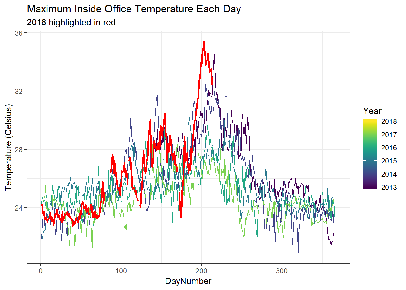
ggplot(officetemp_minmax, aes(x=DayNumber, y=inside_min, colour=Year, group=Year)) +
  geom_line() +
  scale_colour_viridis() +
  geom_line(data=filter(officetemp_minmax, Year==2018), colour="red", size=1) +
  labs(title="Minimum Inside Office Temperature Each Day",
       subtitle="2018 highlighted in red",
       y="Temperature (Celsius)")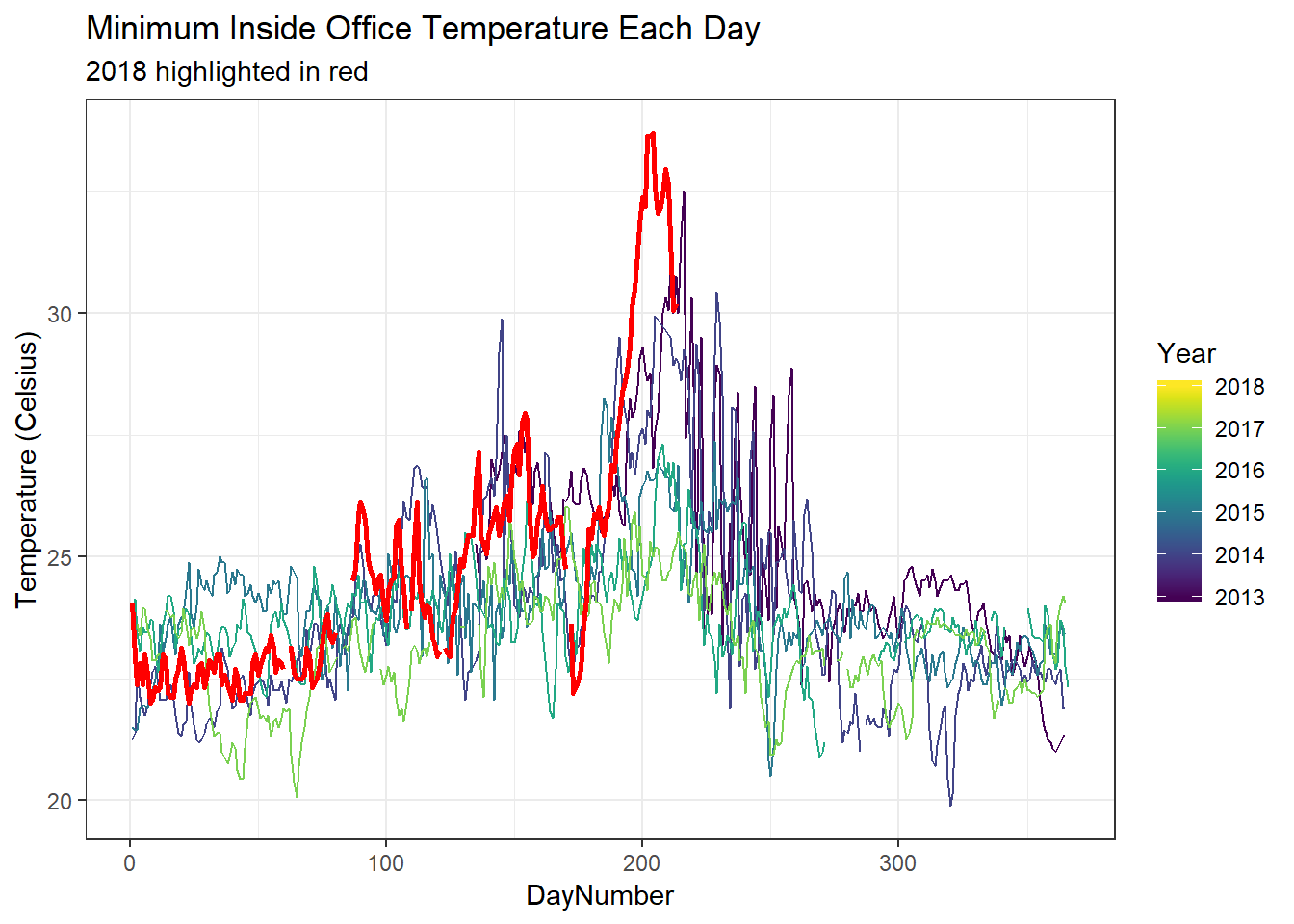
Outside
ggplot(officetemp_minmax, aes(x=DayNumber, y=outside_max, colour=Year, group=Year)) +
  geom_line() +
  scale_colour_viridis() +
  geom_line(data=filter(officetemp_minmax, Year==2018), colour="red", size=1) +
  labs(title="Maximum Outside Office Temperature Each Day",
       subtitle="2018 highlighted in red",
       y="Temperature (Celsius)")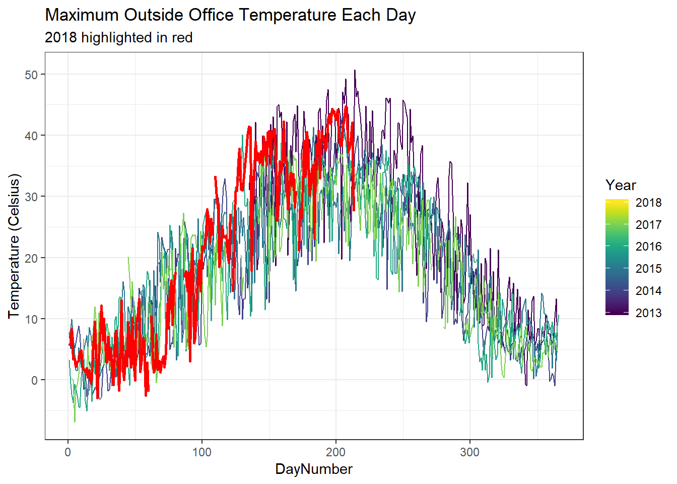
ggplot(officetemp_minmax, aes(x=DayNumber, y=outside_min, colour=Year, group=Year)) +
  geom_line() +
  scale_colour_viridis() +
  geom_line(data=filter(officetemp_minmax, Year==2018), colour="red", size=1) +
  labs(title="Minimum Outside Office Temperature Each Day",
       subtitle="2018 highlighted in red",
       y="Temperature (Celsius)")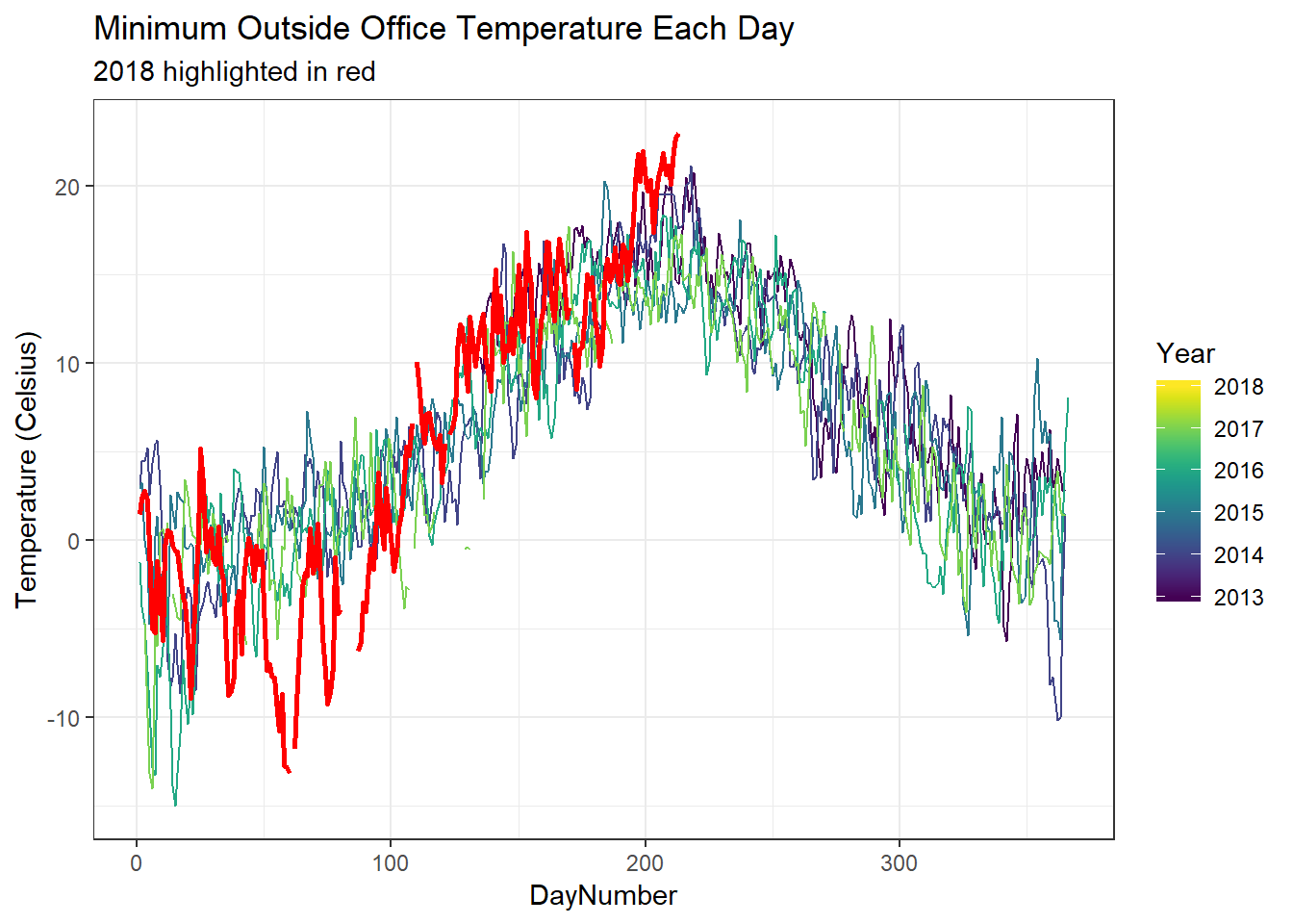
No ventilation!
You might have spotted it from the minimum plots above, but let’s see if we can demonstrate the effect of a lack of ventilation more clearly. I’ll plot the temperature trajectories across each day of the summer months.
officetemp_summers <- officetemp %>%
  filter(DayNumber > 150 & DayNumber < 250) %>%
  mutate( DayFraction = ( 3600*hour(DateTime) +
                            60*minute(DateTime) +
                            second(DateTime)) / (3600*24),
          DayNumber_Time = DayNumber + DayFraction)

ggplot(officetemp_summers, aes(x=DayNumber_Time, y=Inside, group=Year, colour=Year)) +
  geom_line() +
  scale_colour_viridis() +
  labs(title="Inside Office Temperatures Across Each Summer",
       subtitle="Temperature trajectories across each day of summer each year",
       x="Day of the Year", y="Temperature (Celsius)")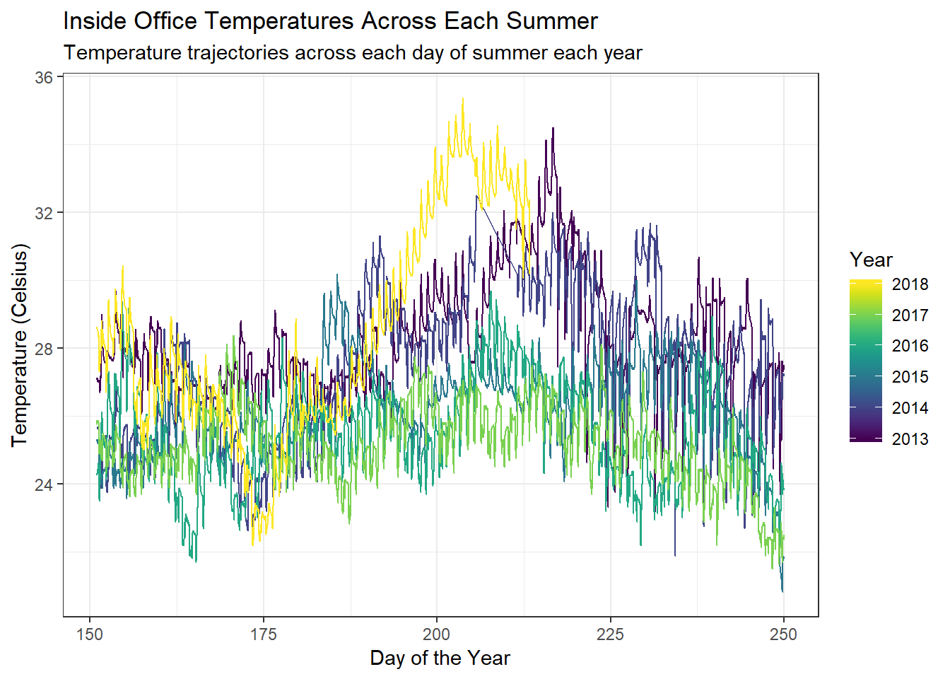
With no ventilation, and thick walls, there is no way for the heat to escape. Note that this plot shows the changes across each 24 hour period! While it does seem to get hotter and cooler, the effect is pretty small. Let’s view this slightly differently.
ggplot(officetemp_minmax, aes(x=DayNumber, y=inside_mean, group=Year, colour=Year, fill=Year)) +
  geom_line() +
  scale_colour_viridis() +
  scale_fill_viridis() +
  xlim(c(150, 250)) +
  geom_ribbon(aes(ymin=inside_min, ymax=inside_max), alpha=0.5) +
  labs(title="Inside Office Temperatures Across Each Summer",
       subtitle="Mean with Daily Range from Minimum to Maximum",
       x="Day of the Year", y="Temperature (Celsius)") +
  facet_wrap(.~Year)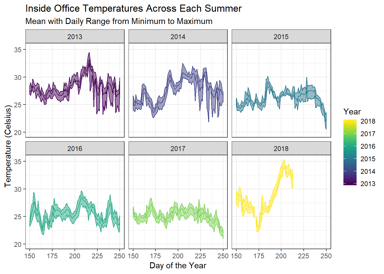
Here, we can see that the room temperature has not dropped below 30°C in our office for over a month, even in the dead of night!
Health and Comfort
Well, judging by my currently sitting in a café with air conditioning, the comfort levels of the office aren’t great. But it would be nice to find something a little more objective… Apparently the standards of the WHO are as follows:
- Over 24°C - cardiovascular risk
- 18-21°C - comfortable temperature
- 18°C - minimum for comfort
- 12-16°C - respiratory risk
- Below 12°C - cardiovascular risk
Let’s take a look at whether the mean indoor temperatures rate compared to these categories.
officetemp_health <- officetemp_minmax %>%
  filter(!is.na(inside_mean)) %>%
  mutate(HealthEffects = cut(inside_mean,
                             breaks=c(-Inf, 12, 16, 18, 21, 24, Inf),
                             labels=c("Cardiovascular Risk (<12)",
                                      "Respiratory Risk (12-16)",
                                      "Uncomfortable (16-18)",
                                      "Comfortable (18-21)",
                                      "Uncomfortable (21-24)",
                                      "Cardiovascular Risk (>24)")),
         HealthEffects = as.factor(HealthEffects))


ggplot(officetemp_health, aes(x=DayNumber, y=Year, fill=HealthEffects)) +
  geom_tile()  +
  labs(title = "Office Temperatures and Health Effects",
       subtitle="Temperature Categories for Daily Mean Office Temperatures") +
  scale_fill_manual(values = c("seagreen4", "yellow3", "red")) +
  scale_y_continuous(breaks = 2013:2018) +
  theme_minimal() +
  theme(legend.position="bottom")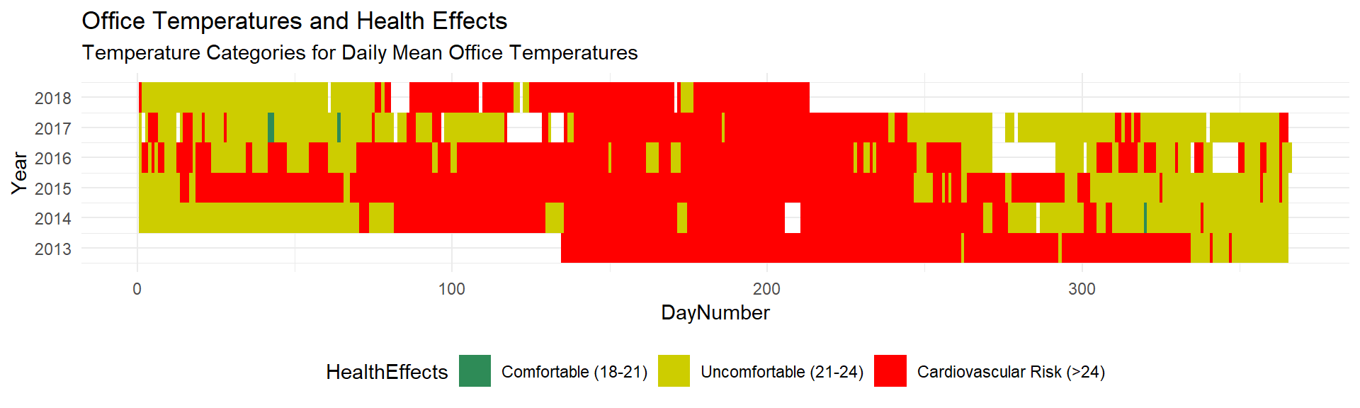
This is actually a bit worse than I expected. There are only a couple of days that the mean temperature has been comfortable, and we’re at cardiovascular risk for 62.1% of the time…
Maybe these guidelines are a little strict. I looked around for some more lenient European guidelines, but which were strict about category bounds. There exist some for Sweden, but it was a bit technical, seems to involve some other measurements too, and pushes my Swedish language skills to where they’re not super comfortable (I’ll plot it with these guidelines if someone can explain them to me). The best other guidelines I could find were here, which specifies that, in Spain, the law states that temperatures should be between 17 and 27 for sedentary work. That is sufficiently clear! Let’s try those guidelines out for size.
officetemp_health <- officetemp_health %>%
  mutate(SpainTemp = cut(inside_mean,
                             breaks=c(-Inf, 17, 27, Inf),
                             labels=c("Illegally Cold (<17)",
                                      "Acceptable (17-27)",
                                      "Illegally Warm (>27)")),
         SpainTemp = as.factor(SpainTemp))


ggplot(officetemp_health, aes(x=DayNumber, y=Year, fill=SpainTemp)) +
  geom_tile()  +
  labs(title = "Office Temperatures according to Spanish Guidelines",
       subtitle="Categories according to Spanish Law for Workplace Temperatures for Sedentary Work") +
  scale_fill_manual(values = c("seagreen4", "red")) +
  scale_y_continuous(breaks = 2013:2018) +
  theme_minimal() +
  theme(legend.position="bottom")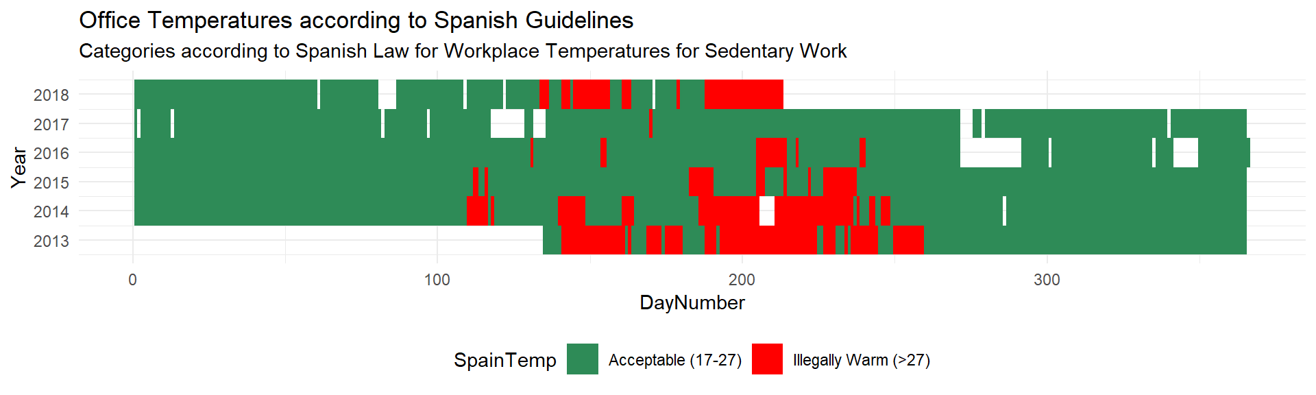
I guess this should even be a point of pride: that our Scandinavian office is reaching temperatures which break workplace temperature regulations in Spain (coincidentally, where Scandinavians tend to go to find some summer sun).
Conclusions
Sweden is having a very hot summer. It is not necessarily the case that there have been especially notable instantaneous temperatures, but rather that the high temperatures were sustained, with several weeks being the hottest weeks on record since the 1960s.
There is a pretty clear trend of an increase in yearly temperature across the last few years.
Our office temperatures are reeeaaaally hot, are almost always uncomfortably so, put us at increased risk of cardiovascular events, and would even break the law in Spain for the temperature of an acceptable working environment.
We will soon be moving to new offices at the new Karolinska Hospital which has recently been built, so presumably our bad ventilation is here to stay until then… However, we are due to switch from closed offices to an open plan offices, so we’ll have to see whether the decrease in temperatures makes up for the increase in noise levels. Or maybe time to invest in some digital noise meters to analyse the difference…….
But in the meantime:
